Stanford Ashcraft


Enterprise systems built at Schwab, Bank of America, and State Farm — engineered for capital, risk, and scalable decision systems.
Integrated Quote
Revenue-critical flow under behavioral friction

Insurance quoting is not simply a form experience—it is a multi-step transaction system shaped by eligibility, identity, pricing, and regulatory constraints. The challenge was reducing abandonment without oversimplifying the underlying logic. By restructuring the flow around progressive decisions and earlier pricing clarity, the experience became faster, more understandable, and more resilient under real-world use.
High-frequency payment workflows redesigned for faster comprehension, clearer hierarchy, and reduced transactional friction.
System-Level Decision Design
Translating complexity into coordinated execution
The work required aligning UX, business rules, engineering dependencies, and operational constraints across multiple teams. I helped shape the flow architecture around identity resolution, eligibility validation, pricing updates, and bind readiness—ensuring the system responded consistently as user inputs changed. The focus was not only interface clarity, but reducing downstream operational risk through better validation and guided interaction.
The quote flow behaved as a live system—resolving risk, pricing, and validation dynamically as users progressed.
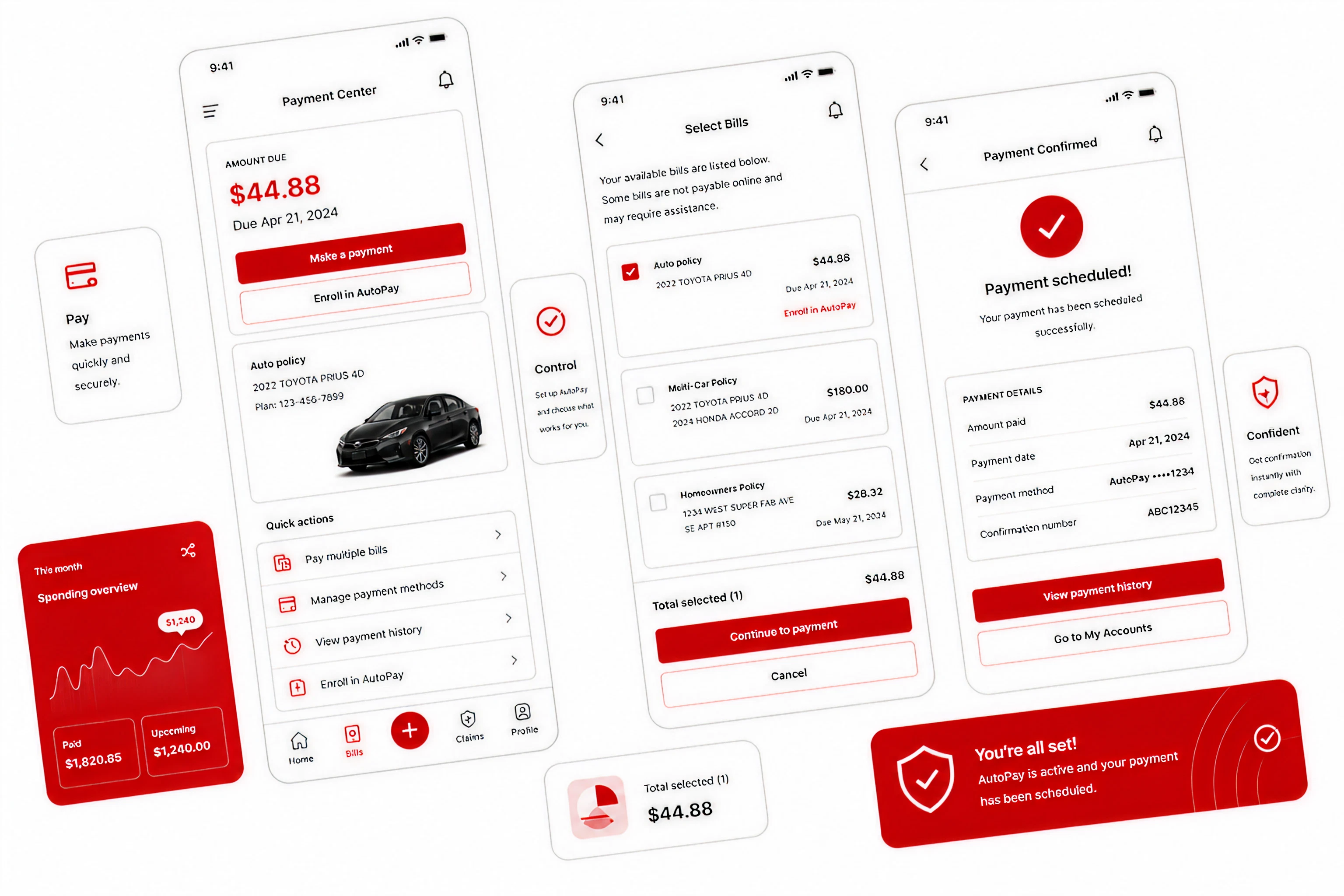
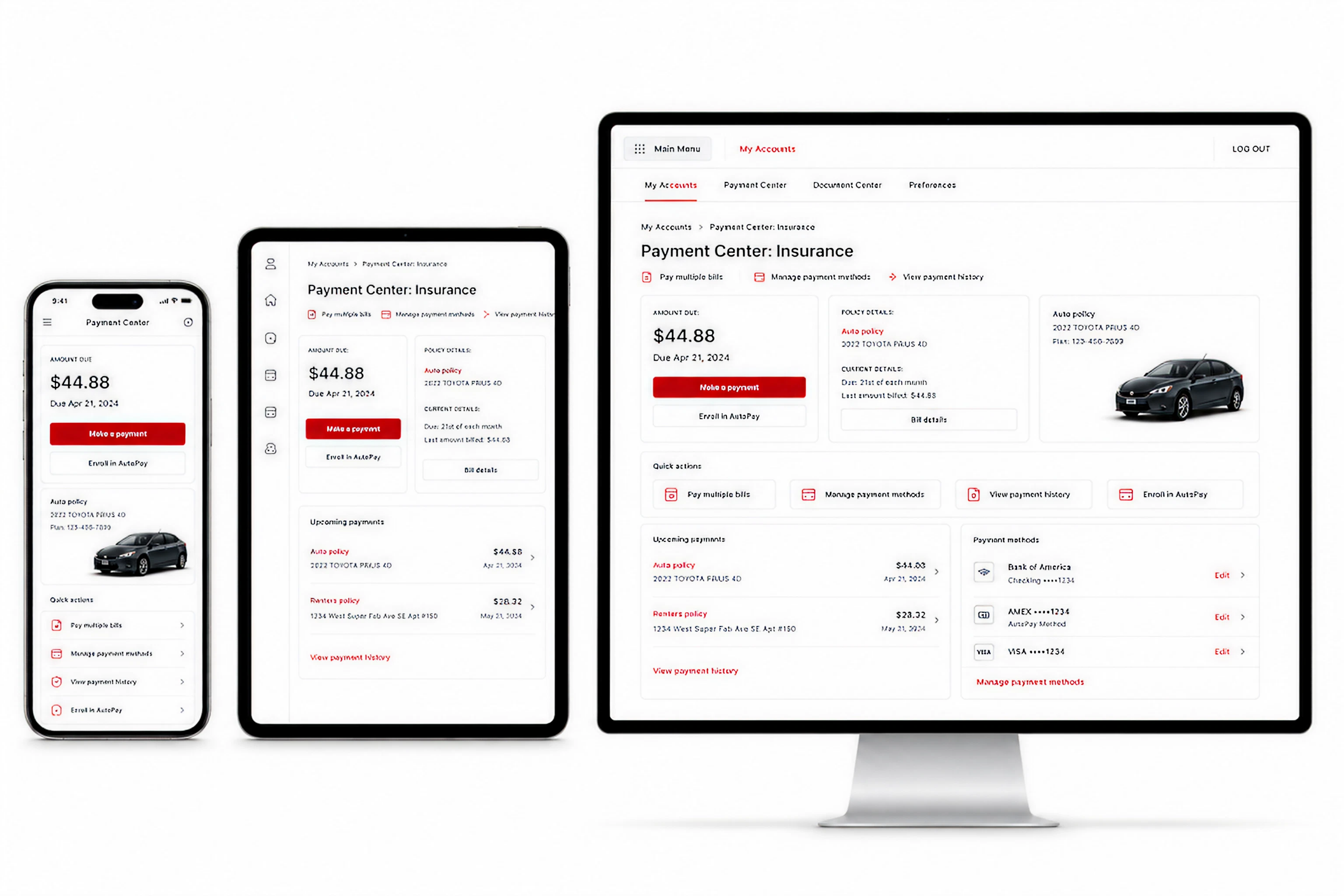
Payment Center
Reducing operational friction in a high-frequency workflow
The Payment Center served as one of the highest-traffic authenticated experiences in the platform. Users needed immediate visibility into balances, policies, due dates, and available actions without navigating unnecessary complexity. The redesign prioritized glanceable hierarchy, faster comprehension, and clearer transactional pathways across responsive breakpoints. Validation, account context, and payment actions were surfaced progressively to reduce backtracking and improve confidence before submission. The experience balanced enterprise-scale operational requirements with a simpler, more consumer-oriented interaction model.
High-frequency payment workflows redesigned for faster comprehension, clearer hierarchy, and reduced transactional friction.
Select Bills
Clarifying multi-policy payment decisions across devices
Users managing multiple policies often struggled to understand which balances were due, how payments were grouped, and what actions were required next. The redesigned bill-selection flow simplified comparison and prioritization through structured grouping, progressive totals, and clearer status visibility. Responsive layouts ensured consistency across mobile, tablet, and desktop environments while maintaining transactional confidence. The flow emphasized transparency and decision clarity—helping users understand what they were paying, why it mattered, and how their selections impacted the final transaction before submission.
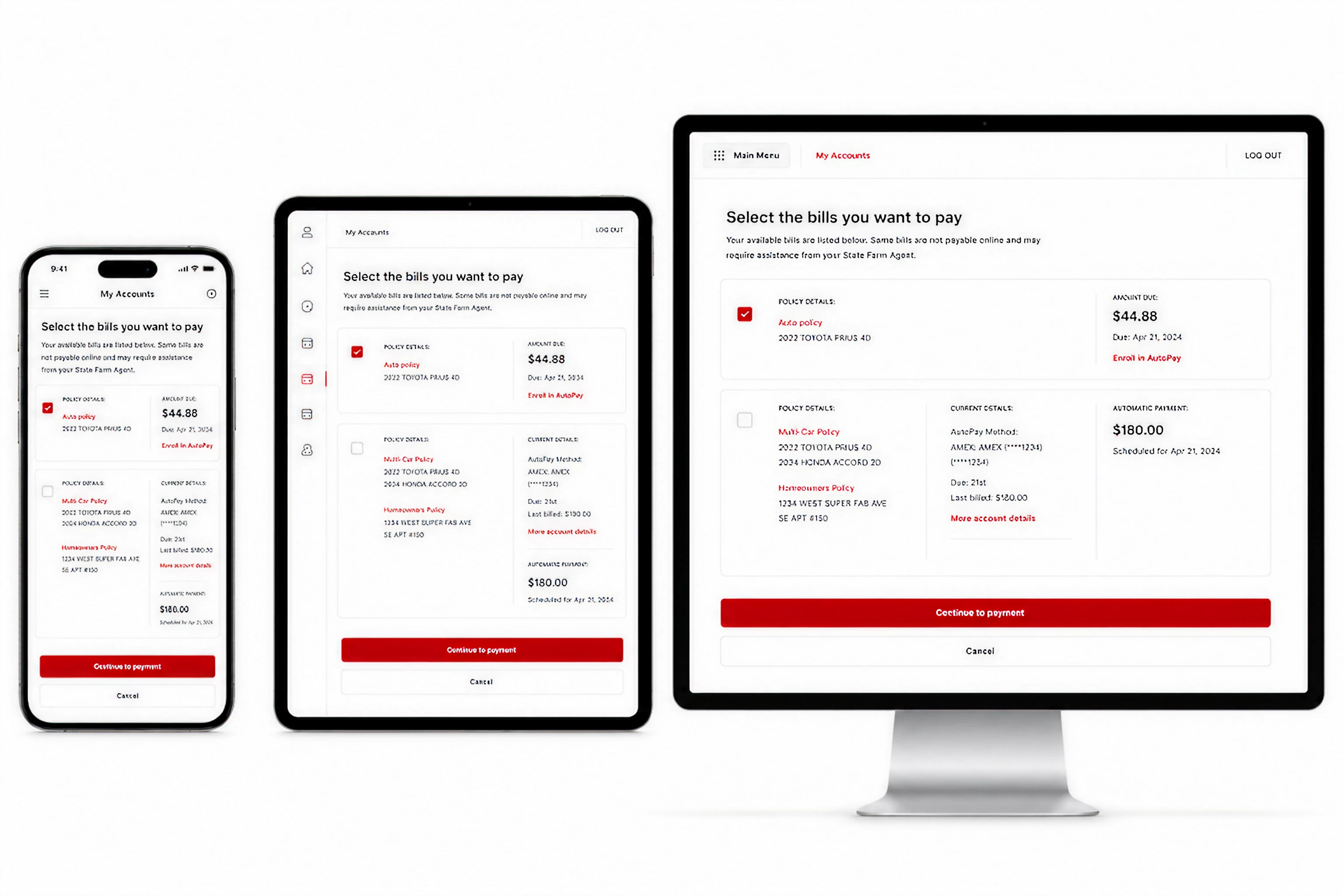
Structured bill selection reduced ambiguity and improved decision confidence before payment submission.
Confirmation
Confirmation & Resolution
Confirmation screens are often treated as endpoints, but in transactional systems they also function as reassurance, validation, and operational continuity. The redesigned confirmation experience clarified payment status, account updates, confirmation references, and next-best-actions immediately after submission. The system emphasized trust and resolution—ensuring users understood what had changed, what was completed successfully, and what actions remained available. This reduced uncertainty after payment while reinforcing consistency across the broader billing ecosystem.
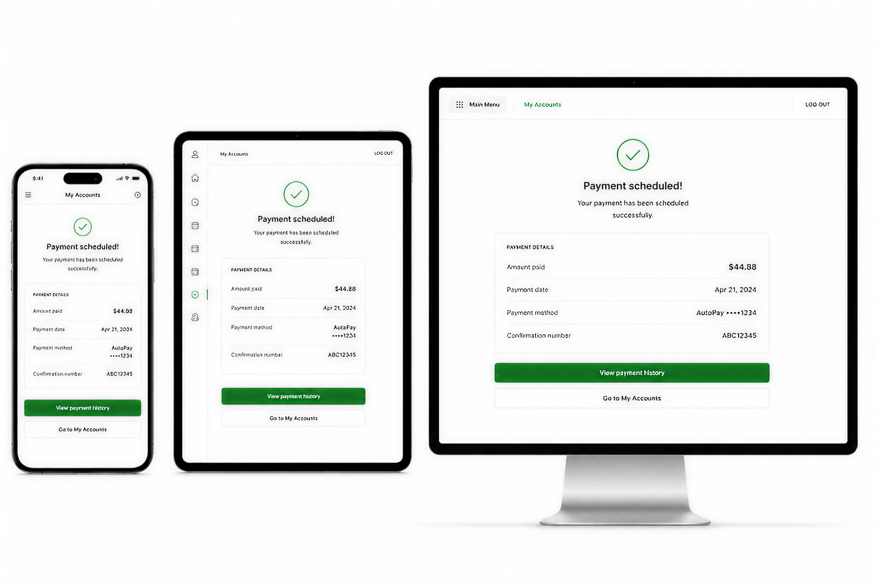
Confirmation became more than a receipt—it reinforced trust, completion, and next-step clarity after transaction submission.
Metrics & Impact
Measured improvements across clarity, completion, and operational efficiency
Measured improvements across clarity, completion, and operational efficiency
The redesign improved how users progressed through quoting while reducing invalid submissions and unnecessary backtracking. The experience balanced transactional speed with system reliability, helping users move from intent to bind with greater confidence.
🌟 Quote completion clarity ↑ 34%
⏱ Time-to-bind ↓ 29%
📉 Invalid submission errors ↓ 41%
📈 User continuation across quote stages ↑ 26%

Design System Walkthroughs
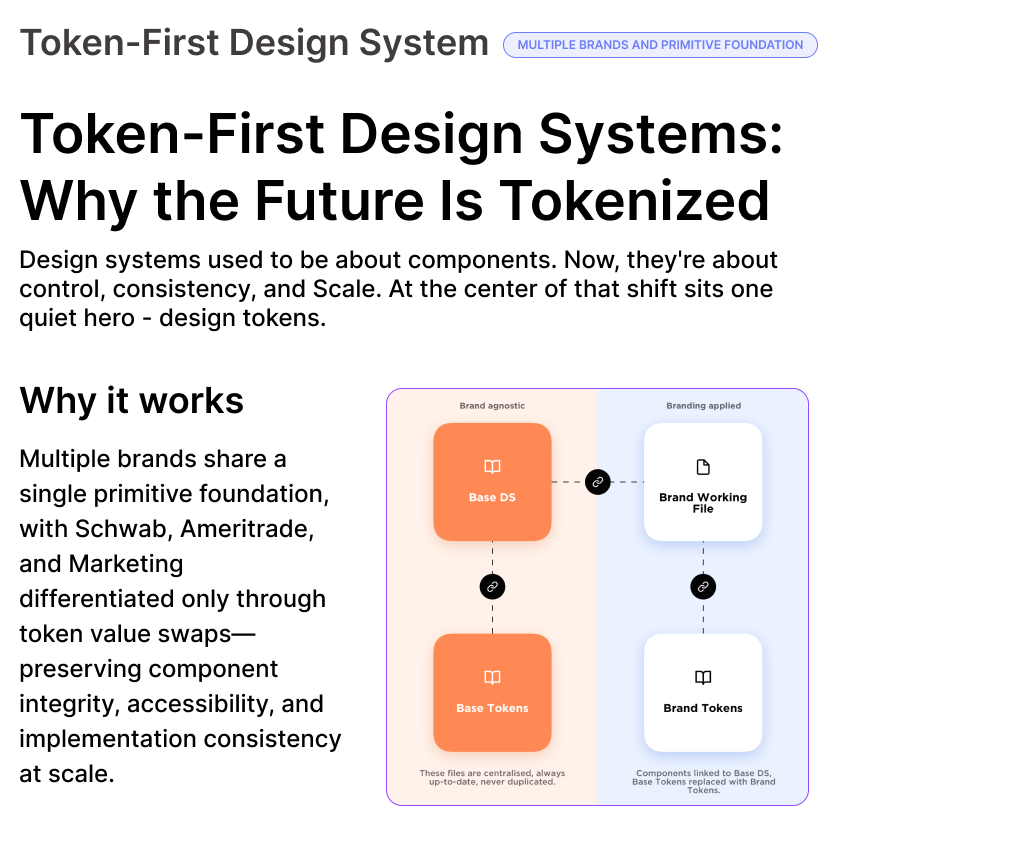
Reducing design drift and compliance riskVega Design System — Foundations
• Shared FinTech design system for advisor platforms
• Defined primitives: color roles, typography scale, spacing, radius
• Button and component variants standardized at the system level
• Token-first approach ensures WCAG 2.0 accessibility by default
• Enables consistent, predictable implementation across desktop and mobileBaselineBefore systemization, UI patterns were fragmented across teams, with inconsistent styling, duplicated components, and manual rework. Designers and engineers relied on ad-hoc decisions, increasing review cycles and regression risk.
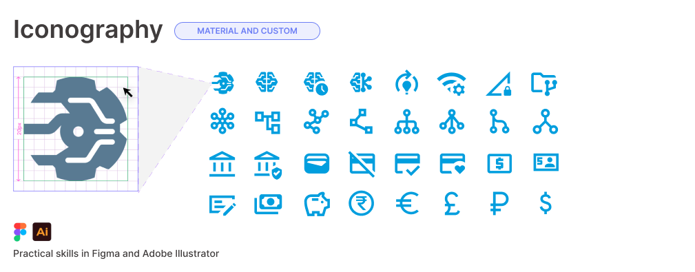
FinTech Iconography System
A scalable icon set designed for financial clarity and density. Standardized proportions, stroke weights, and semantic usage to reduce cognitive load and support rapid scanning in data-heavy advisor workflows.
Tokens & Engineering Integration
Design tokens connected Figma components to the Angular codebase, enabling shared definitions for color, spacing, and states. Reduced design-to-dev translation errors while supporting scalable theming and future system expansion.
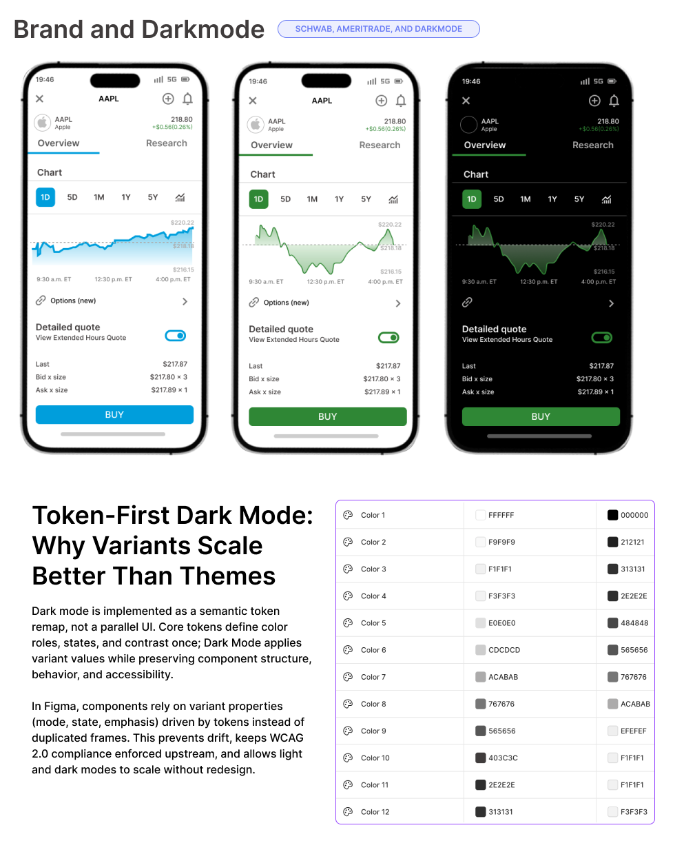
Component Variants & Dark Mode
Documented component variants for light and dark modes, including tables, inputs, and controls. Ensured contrast compliance, token-driven theming, and consistent behavior across responsive layouts and dual-monitor advisor environments.
Metrics & Impact
Metrics 30 days pre/post adoption (n=428 advisors):
🌟 UI consistency issues ↓ 61%
⏱ Design-to-dev handoff time ↓ 48%
📉 UI regressions ↓ 37%
📈 CSAT for core workflows ↑ 22%
Go to Governace

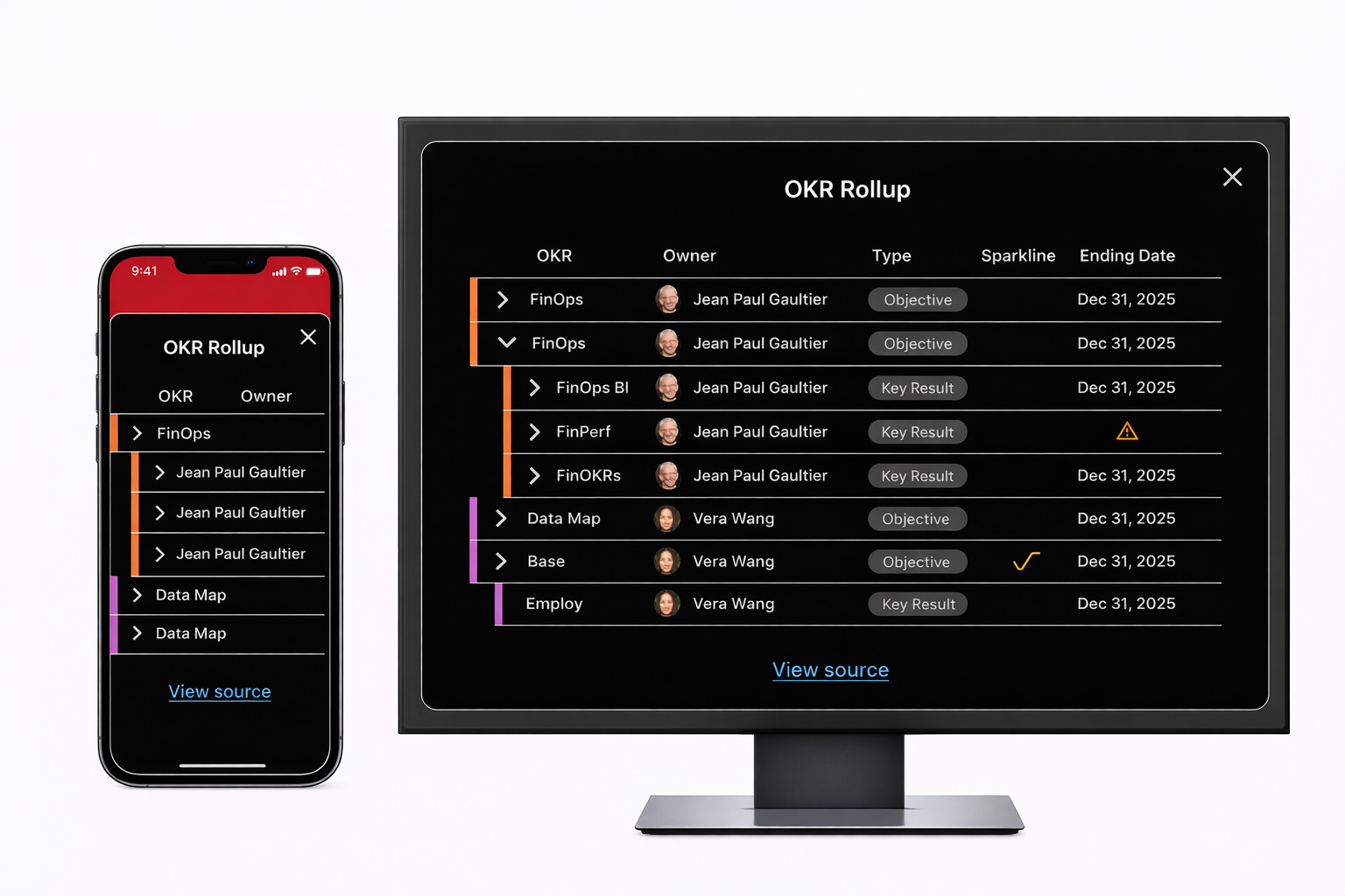
Dashboard OKRs
High-constraint, executive alignment problemKey Outcomes
• Eliminated daily time waste, boosting individual productivity and focus
• Established a single, reliable source for personalized OKR visibility
• Accelerated executive and team alignment in a high-velocity enterprise environmentBaselineAll metrics measured 60 days pre/post launch, n=312 active users
System-Level
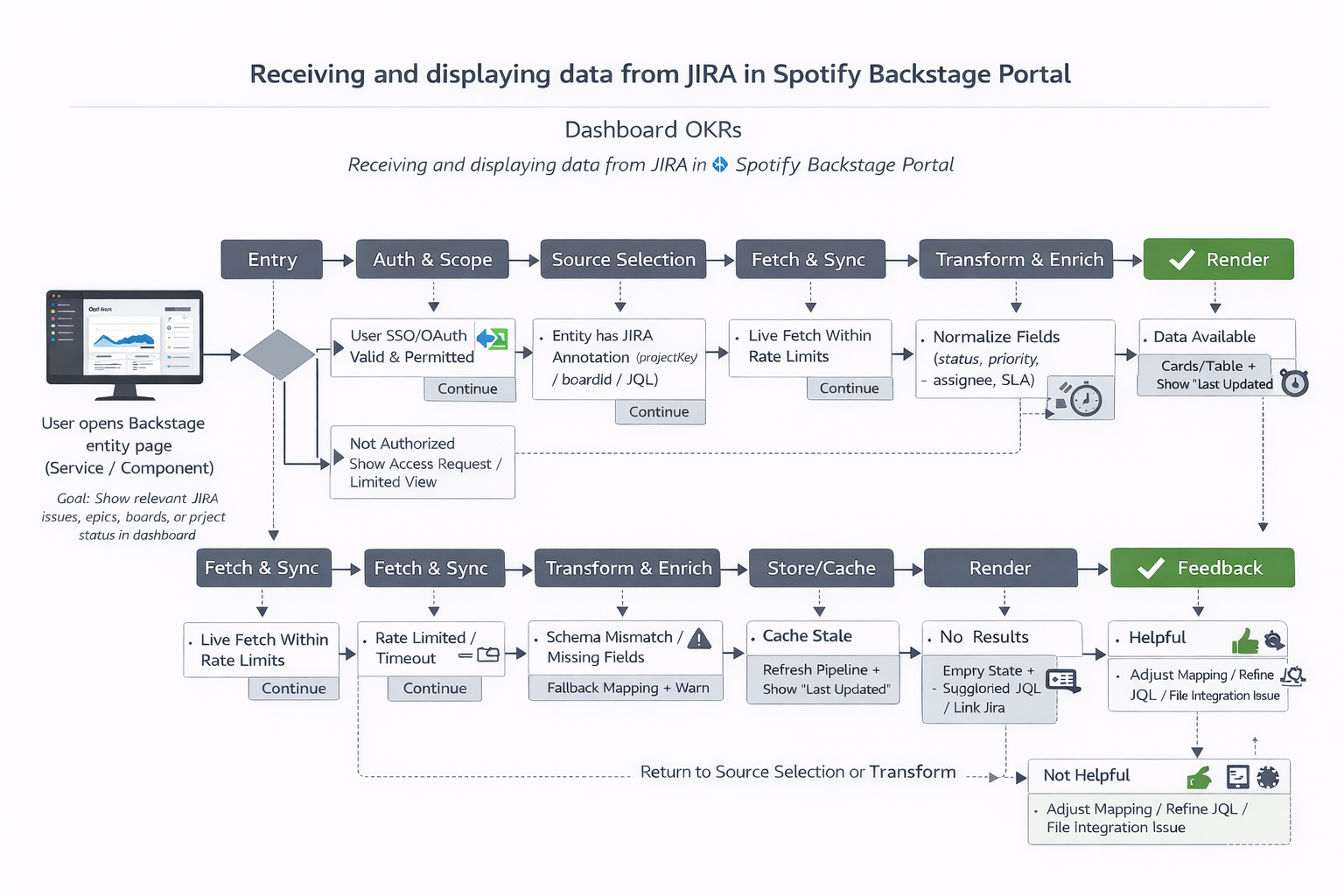
This shows how Jira data is safely authorized, mapped, normalized, and cached before rendering in Backstage—balancing real-time accuracy with reliability, performance, and clear recovery paths when permissions, schemas, or rate limits fail.
Problem & Opportunity
Engineers and leads wasted 5–12 minutes daily hunting OKRs across disparate tools (Agility, Confluence, scattered dashboards), leading to context-switching friction and delayed alignment. Traditional customizable dashboards suffered from visual noise, slow load times, and stale data.
Research in 30 seconds
What the data tells us
⚠️ Engineers and leads wasted 5–12 min per day hunting
OKRs across Agility, Confluence, and scattered dashboards
Solution & Impact
Prioritized and shipped a lightweight, zero-page-reload modal accessible from Favorites—pulling live data from Agility and auto-personalizing rollups by user ID/role. This delivered instant, relevant insights without overwhelming the core interface.
The Numbers
What the data tells us
🌟 Result → 94 % of users now check OKRs daily (was 31 %)
average session time to view OKRs ↓ 87 % (from ~7 min → <45 s)
Gen Hub
Productivity recovery under AI and scale pressureKey Outcomes
• Reclaimed ~4.6 hours/week per engineer, directly boosting coding focus and output
• Reduced context-switching on repeatable tasks by targeting 85% of lost time
• Created a scalable foundation for AI-driven knowledge access, accelerating onboarding, debugging, and cross-team collaboration
BaselineAll metrics measured 60 days pre/post launch, n=312 active users
System-Level
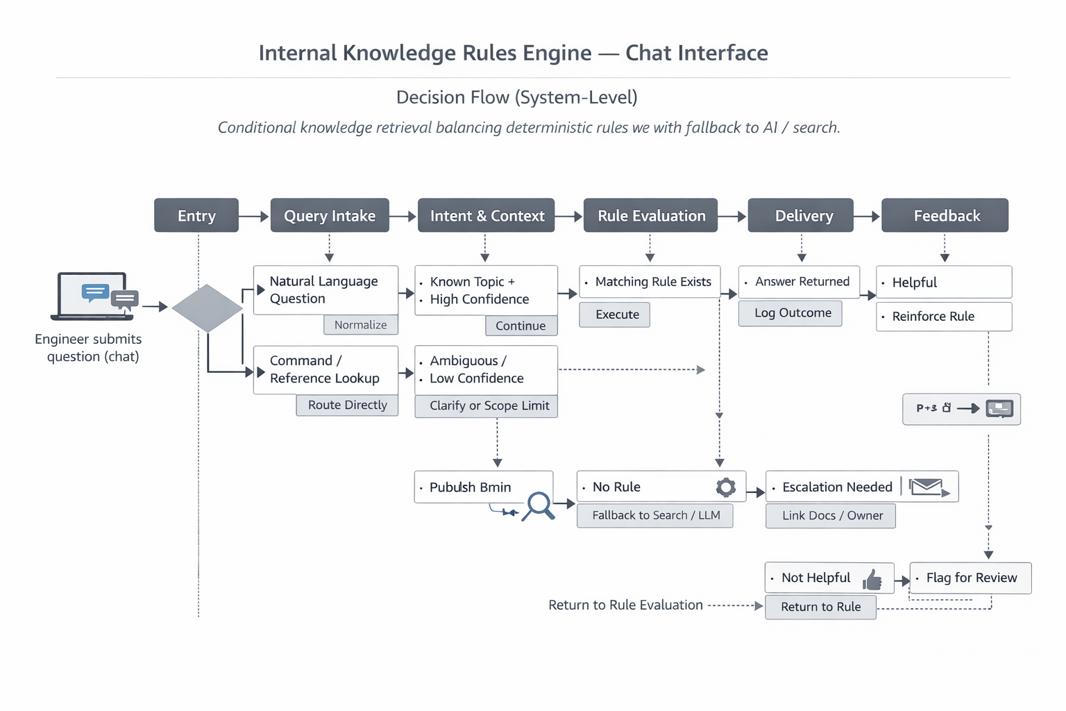
This shows how the knowledge system prioritizes deterministic rules first, falls back to search or AI when needed, and continuously improves through feedback—balancing speed, trust, and accuracy for engineers using a shared chat interface.
Problem & Opportunity
Engineers lost ~4.6 hours per week chasing configs, secrets, runbooks, and scattered Slack threads (validated via internal logs and surveys). 85% of this wasted time stemmed from repeatable, non-coding tasks—creating major productivity drag in a high-velocity environment.
Research in 30 seconds
What the data tells us
⚠️ 85 % of that lost time was on repeatable, non-coding tasks
Solution & Impact
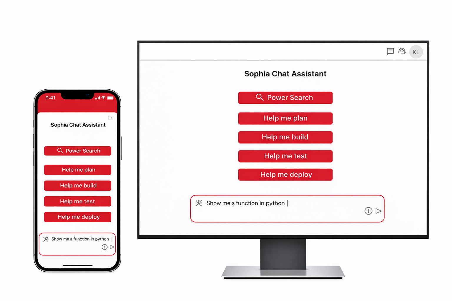
Prioritized and delivered Gen Hub: a unified, intuitive hub with an embedded AI assistant (Sophia) that surfaces relevant knowledge through a single, intelligent search—aggregating disparate sources in real time for instant, contextual results.
The Numbers
What the data tells us
🌟 ↑ 42 % overall satisfaction
↓ 68 % time to onboard a new project (60 days post-launch, n=312)
© 2026 Stanford Ashcraft. Portfolio work shown for illustrative purposes.
CASE STUDIES
Enterprise systems built at Schwab, Bank of America, and State Farm — engineered for capital, risk, and scalable decision systems.
DESIGN SYSTEMS
DESIGN SYSTEMS
Integrated Quote
Revenue-critical flow under behavioral friction
Insurance quoting is not simply a form experience—it is a multi-step transaction system shaped by eligibility, identity, pricing, and regulatory constraints. The challenge was reducing abandonment without oversimplifying the underlying logic. By restructuring the flow around progressive decisions and earlier pricing clarity, the experience became faster, more understandable, and more resilient under real-world use.
High-frequency payment workflows redesigned for faster comprehension, clearer hierarchy, and reduced transactional friction.
System-Level Decision Design
Translating complexity into coordinated execution
The work required aligning UX, business rules, engineering dependencies, and operational constraints across multiple teams. I helped shape the flow architecture around identity resolution, eligibility validation, pricing updates, and bind readiness—ensuring the system responded consistently as user inputs changed. The focus was not only interface clarity, but reducing downstream operational risk through better validation and guided interaction.
The quote flow behaved as a live system—resolving risk, pricing, and validation dynamically as users progressed.
Payment Center
Reducing operational friction in a high-frequency workflow
The Payment Center served as one of the highest-traffic authenticated experiences in the platform. Users needed immediate visibility into balances, policies, due dates, and available actions without navigating unnecessary complexity. The redesign prioritized glanceable hierarchy, faster comprehension, and clearer transactional pathways across responsive breakpoints. Validation, account context, and payment actions were surfaced progressively to reduce backtracking and improve confidence before submission. The experience balanced enterprise-scale operational requirements with a simpler, more consumer-oriented interaction model.
High-frequency payment workflows redesigned for faster comprehension, clearer hierarchy, and reduced transactional friction.
Select Bills
Clarifying multi-policy payment decisions across devices
Users managing multiple policies often struggled to understand which balances were due, how payments were grouped, and what actions were required next. The redesigned bill-selection flow simplified comparison and prioritization through structured grouping, progressive totals, and clearer status visibility. Responsive layouts ensured consistency across mobile, tablet, and desktop environments while maintaining transactional confidence. The flow emphasized transparency and decision clarity—helping users understand what they were paying, why it mattered, and how their selections impacted the final transaction before submission.
Structured bill selection reduced ambiguity and improved decision confidence before payment submission.
Confirmation
Confirmation & Resolution
Confirmation screens are often treated as endpoints, but in transactional systems they also function as reassurance, validation, and operational continuity. The redesigned confirmation experience clarified payment status, account updates, confirmation references, and next-best-actions immediately after submission. The system emphasized trust and resolution—ensuring users understood what had changed, what was completed successfully, and what actions remained available. This reduced uncertainty after payment while reinforcing consistency across the broader billing ecosystem.
Confirmation became more than a receipt—it reinforced trust, completion, and next-step clarity after transaction submission.
Metrics & Impact
Measured improvements across clarity, completion, and operational efficiency
Measured improvements across clarity, completion, and operational efficiency
The redesign improved how users progressed through quoting while reducing invalid submissions and unnecessary backtracking. The experience balanced transactional speed with system reliability, helping users move from intent to bind with greater confidence.
🌟 Quote completion clarity ↑ 34%
⏱ Time-to-bind ↓ 29%
📉 Invalid submission errors ↓ 41%
📈 User continuation across quote stages ↑ 26%
Design System Walkthroughs
Reducing design drift and compliance risk
Vega Design System — Foundations
• Shared FinTech design system for advisor platforms
• Defined primitives: color roles, typography scale, spacing, radius
• Button and component variants standardized at the system level
• Token-first approach ensures WCAG 2.0 accessibility by default
• Enables consistent, predictable implementation across desktop and mobile
BaselineBefore systemization, UI patterns were fragmented across teams, with inconsistent styling, duplicated components, and manual rework. Designers and engineers relied on ad-hoc decisions, increasing review cycles and regression risk.
FinTech Iconography System
A scalable icon set designed for financial clarity and density. Standardized proportions, stroke weights, and semantic usage to reduce cognitive load and support rapid scanning in data-heavy advisor workflows.
Tokens & Engineering Integration
Design tokens connected Figma components to the Angular codebase, enabling shared definitions for color, spacing, and states. Reduced design-to-dev translation errors while supporting scalable theming and future system expansion.
Component Variants & Dark Mode
Documented component variants for light and dark modes, including tables, inputs, and controls. Ensured contrast compliance, token-driven theming, and consistent behavior across responsive layouts and dual-monitor advisor environments.
Metrics & Impact
Metrics 30 days pre/post adoption (n=428 advisors):
🌟 UI consistency issues ↓ 61%
⏱ Design-to-dev handoff time ↓ 48%
📉 UI regressions ↓ 37%
📈 CSAT for core workflows ↑ 22%
Go to Governace
Dashboard OKRs
High-constraint, executive alignment problem
Key Outcomes
• Eliminated daily time waste, boosting individual productivity and focus
• Established a single, reliable source for personalized OKR visibility
• Accelerated executive and team alignment in a high-velocity enterprise environment
BaselineAll metrics measured 60 days pre/post launch, n=312 active users
System-Level
This shows how Jira data is safely authorized, mapped, normalized, and cached before rendering in Backstage—balancing real-time accuracy with reliability, performance, and clear recovery paths when permissions, schemas, or rate limits fail.
Problem & Opportunity
Engineers and leads wasted 5–12 minutes daily hunting OKRs across disparate tools (Agility, Confluence, scattered dashboards), leading to context-switching friction and delayed alignment. Traditional customizable dashboards suffered from visual noise, slow load times, and stale data.
Research in 30 seconds
What the data tells us
⚠️ Engineers and leads wasted 5–12 min per day hunting
OKRs across Agility, Confluence, and scattered dashboards
Solution & Impact
Prioritized and shipped a lightweight, zero-page-reload modal accessible from Favorites—pulling live data from Agility and auto-personalizing rollups by user ID/role. This delivered instant, relevant insights without overwhelming the core interface.
The Numbers
What the data tells us
🌟 Result → 94 % of users now check OKRs daily (was 31 %)
average session time to view OKRs ↓ 87 % (from ~7 min → <45 s)
Productivity recovery under AI and scale pressure
Key Outcomes
• Reclaimed ~4.6 hours/week per engineer, directly boosting coding focus and output
• Reduced context-switching on repeatable tasks by targeting 85% of lost time
• Created a scalable foundation for AI-driven knowledge access, accelerating onboarding, debugging, and cross-team collaborationBaselineAll metrics measured 60 days pre/post launch, n=312 active users
System-Level
This shows how the knowledge system prioritizes deterministic rules first, falls back to search or AI when needed, and continuously improves through feedback—balancing speed, trust, and accuracy for engineers using a shared chat interface.
Problem & Opportunity
Engineers lost ~4.6 hours per week chasing configs, secrets, runbooks, and scattered Slack threads (validated via internal logs and surveys). 85% of this wasted time stemmed from repeatable, non-coding tasks—creating major productivity drag in a high-velocity environment.
Research in 30 seconds
What the data tells us
⚠️ 85 % of that lost time was on repeatable, non-coding tasks
Solution & Impact
Prioritized and delivered Gen Hub: a unified, intuitive hub with an embedded AI assistant (Sophia) that surfaces relevant knowledge through a single, intelligent search—aggregating disparate sources in real time for instant, contextual results.
The Numbers
What the data tells us
🌟 ↑ 42 % overall satisfaction
↓ 68 % time to onboard a new project (60 days post-launch, n=312)
© 2026 Stanford Ashcraft. Portfolio work shown for illustrative purposes.
© 2026 Stanford Ashcraft. Portfolio work shown for illustrative purposes.

CASE STUDIES
Enterprise systems built at Schwab, Bank of America, and State Farm — engineered for capital, risk, and scalable decision systems.
CASE STUDY REVIEW
Integrated Quote
A billion-dollar decision flow built for clarity, trust, and speed
Insurance quoting is not simply a form experience—it is a multi-step transaction system shaped by eligibility, identity, pricing, and regulatory constraints. The challenge was reducing abandonment without oversimplifying the underlying logic. By restructuring the flow around progressive decisions and earlier pricing clarity, the experience became faster, more understandable, and more resilient under real-world use.
High-frequency payment workflows redesigned for faster comprehension, clearer hierarchy, and reduced transactional friction.
System-Level Decision Design
Translating complexity into coordinated execution
The work required aligning UX, business rules, engineering dependencies, and operational constraints across multiple teams. I helped shape the flow architecture around identity resolution, eligibility validation, pricing updates, and bind readiness—ensuring the system responded consistently as user inputs changed. The focus was not only interface clarity, but reducing downstream operational risk through better validation and guided interaction.
The quote flow behaved as a live system—resolving risk, pricing, and validation dynamically as users progressed.
Payment Center
Reducing operational friction in a high-frequency workflow
The Payment Center served as one of the highest-traffic authenticated experiences in the platform. Users needed immediate visibility into balances, policies, due dates, and available actions without navigating unnecessary complexity. The redesign prioritized glanceable hierarchy, faster comprehension, and clearer transactional pathways across responsive breakpoints. Validation, account context, and payment actions were surfaced progressively to reduce backtracking and improve confidence before submission. The experience balanced enterprise-scale operational requirements with a simpler, more consumer-oriented interaction model.
High-frequency payment workflows redesigned for faster comprehension, clearer hierarchy, and reduced transactional friction.
Select Bills
Clarifying multi-policy payment decisions across devices
Users managing multiple policies often struggled to understand which balances were due, how payments were grouped, and what actions were required next. The redesigned bill-selection flow simplified comparison and prioritization through structured grouping, progressive totals, and clearer status visibility. Responsive layouts ensured consistency across mobile, tablet, and desktop environments while maintaining transactional confidence. The flow emphasized transparency and decision clarity—helping users understand what they were paying, why it mattered, and how their selections impacted the final transaction before submission.
Structured bill selection reduced ambiguity and improved decision confidence before payment submission.
Confirmation
Confirmation & Resolution
Confirmation screens are often treated as endpoints, but in transactional systems they also function as reassurance, validation, and operational continuity. The redesigned confirmation experience clarified payment status, account updates, confirmation references, and next-best-actions immediately after submission. The system emphasized trust and resolution—ensuring users understood what had changed, what was completed successfully, and what actions remained available. This reduced uncertainty after payment while reinforcing consistency across the broader billing ecosystem.
Confirmation became more than a receipt—it reinforced trust, completion, and next-step clarity after transaction submission.
Metrics & Impact
Measured improvements across clarity, completion, and operational efficiency
Measured improvements across clarity, completion, and operational efficiency
The redesign improved how users progressed through quoting while reducing invalid submissions and unnecessary backtracking. The experience balanced transactional speed with system reliability, helping users move from intent to bind with greater confidence.
🌟 Quote completion clarity ↑ 34%
⏱ Time-to-bind ↓ 29%
📉 Invalid submission errors ↓ 41%
📈 User continuation across quote stages ↑ 26%
Design System Walkthroughs
Reducing design drift and compliance risk
Vega Design System — Foundations
• Shared FinTech design system for advisor platforms
• Defined primitives: color roles, typography scale, spacing, radius
• Button and component variants standardized at the system level
• Token-first approach ensures WCAG 2.0 accessibility by default
• Enables consistent, predictable implementation across desktop and mobileBaselineBefore systemization, UI patterns were fragmented across teams, with inconsistent styling, duplicated components, and manual rework. Designers and engineers relied on ad-hoc decisions, increasing review cycles and regression risk.
FinTech Iconography System
A scalable icon set designed for financial clarity and density. Standardized proportions, stroke weights, and semantic usage to reduce cognitive load and support rapid scanning in data-heavy advisor workflows.
Tokens & Engineering Integration
Design tokens connected Figma components to the Angular codebase, enabling shared definitions for color, spacing, and states. Reduced design-to-dev translation errors while supporting scalable theming and future system expansion.
Component Variants & Dark Mode
Documented component variants for light and dark modes, including tables, inputs, and controls. Ensured contrast compliance, token-driven theming, and consistent behavior across responsive layouts and dual-monitor advisor environments.
Metrics & Impact
Metrics 30 days pre/post adoption (n=428 advisors):
🌟 UI consistency issues ↓ 61%
⏱ Design-to-dev handoff time ↓ 48%
📉 UI regressions ↓ 37%
📈 CSAT for core workflows ↑ 22%
Go to Governace
Dashboard OKRs
High-constraint, executive alignment problem
Key Outcomes
• Eliminated daily time waste, boosting individual productivity and focus
• Established a single, reliable source for personalized OKR visibility
• Accelerated executive and team alignment in a high-velocity enterprise environmentBaselineMetrics 30 days pre/post launch, n=428 active users
System-Level
This shows how Jira data is safely authorized, mapped, normalized, and cached before rendering in Backstage—balancing real-time accuracy with reliability, performance, and clear recovery paths when permissions, schemas, or rate limits fail.
Problem & Opportunity
Engineers and leads wasted 5–12 minutes daily hunting OKRs across disparate tools (Agility, Confluence, scattered dashboards), leading to context-switching friction and delayed alignment. Traditional customizable dashboards suffered from visual noise, slow load times, and stale data.
Solution & Impact
Prioritized and shipped a lightweight, zero-page-reload modal accessible from Favorites—pulling live data from Agility and auto-personalizing rollups by user ID/role. This delivered instant, relevant insights without overwhelming the core interface.
Research in 30 seconds
What the data tells us
⚠️ Engineers and leads wasted 5–12 min per day hunting
OKRs across Agility, Confluence, and scattered dashboards
The Numbers
What the data tells us
🌟 Result → 94 % of users now check OKRs daily (was 31 %)
average session time to view OKRs ↓ 87 % (from ~7 min → <45 s)
GenHub
Productivity recovery under AI and scale pressure
Key Outcomes
• Reclaimed ~4.6 hours/week per engineer, directly boosting coding focus and output
• Reduced context-switching on repeatable tasks by targeting 85% of lost time
• Created a scalable foundation for AI-driven knowledge access, accelerating onboarding, debugging, and cross-team collaboration
BaselineAll metrics measured 60 days pre/post launch, n=312 active users
System-Level
This shows how the knowledge system prioritizes deterministic rules first, falls back to search or AI when needed, and continuously improves through feedback—balancing speed, trust, and accuracy for engineers using a shared chat interface.
Problem & Opportunity
Engineers lost ~4.6 hours per week chasing configs, secrets, runbooks, and scattered Slack threads (validated via internal logs and surveys). 85% of this wasted time stemmed from repeatable, non-coding tasks—creating major productivity drag in a high-velocity environment.
Solution & Impact
Prioritized and delivered Gen Hub: a unified, intuitive hub with an embedded AI assistant (Sophia) that surfaces relevant knowledge through a single, intelligent search—aggregating disparate sources in real time for instant, contextual results.
Research in 30 seconds
What the data tells us
⚠️ 85 % of that lost time was on repeatable, non-coding tasks
The Numbers
What the data tells us
🌟 ↑ 42 % overall satisfaction
↓ 68 % time to onboard a new project (60 days post-launch, n=312)
© 2026 Stanford Ashcraft. Portfolio work shown for illustrative purposes.
CASE STUDIES